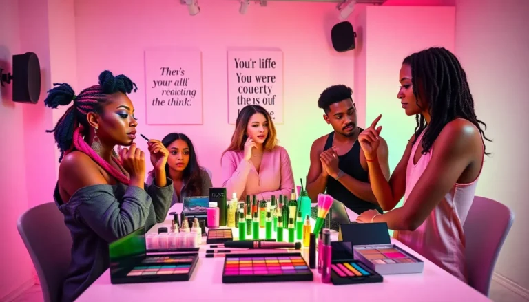
Color palettes are like the secret sauce of design, turning bland into grand with just a few swatches. Whether it’s for a website, a room makeover, or that new art project, the right colors can evoke emotions, set moods, and even make a statement—like a bold fashion choice that says, “I woke up like this.”
But let’s be real: picking colors can feel like trying to solve a Rubik’s cube while blindfolded. Fear not! This guide will help demystify the world of color palettes, making it easier than ever to find the perfect combo that’ll have people saying, “Wow, how did you come up with that?” Get ready to unleash your inner artist and transform your projects into vibrant masterpieces.
Understanding Color Palettes
Color palettes consist of an organized collection of colors that work harmoniously together. Designers employ these color combinations to create specific moods and visual appeal in various projects.
Definition of Color Palettes
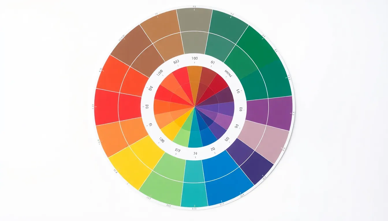
A color palette represents a selection of hues chosen for a specific design theme or project. It can include primary colors, secondary colors, and accent colors. Combining hues creates a balanced look, while contrasting shades can highlight particular elements. Some palettes may incorporate complementary colors, while others utilize analogous colors to evoke certain feelings. When designers choose colors, they consider the intended message and overall aesthetic.
Importance of Color Palettes in Design
Color palettes play a crucial role in defining a design’s overall effectiveness. They can communicate emotions, influence decisions, and guide viewer perceptions. An appropriate palette can enhance user experience on websites or create an inviting atmosphere in interior design. Organizations often use consistent color schemes in branding to build recognition and trust. Coordinated colors make a project visually appealing and may attract more attention and engagement. Designing with color palettes elevates artistic quality and promotes coherence across various mediums.
Types of Color Palettes
Understanding different types of color palettes helps in selecting the best combinations for design projects. Each type serves a unique purpose and evokes various feelings.
Monochromatic Color Palettes
Monochromatic color palettes feature variations of a single hue. This approach creates a cohesive look that is pleasing to the eye. Designers typically utilize tints, shades, and tones of the base color to maintain harmony. An example includes utilizing light blue, medium blue, and dark blue in a website design. Benefits of this palette include simplicity, elegance, and ease of use. Projects employing monochromatic palettes often convey a sense of calm and sophistication.
Analogous Color Palettes
Analogous color palettes consist of colors located next to each other on the color wheel. These palettes typically incorporate three colors, creating a unified appearance. Designers find success with examples such as blue, blue-green, and green in branding efforts. The resulting harmony fosters a calming and serene atmosphere. Common uses for these palettes include natural themes or spaces needing soft transitions. The visual connection between adjacent colors enhances the overall design, providing depth and coherence.
Complementary Color Palettes
Complementary color palettes utilize colors that are opposite each other on the color wheel. The strong contrast results in a vibrant visual dynamic. Designers often use these palettes to create striking impacts in graphics or marketing materials, like pairing red with green for a festive theme. This technique draws attention and emphasizes key elements in a design. Projects featuring complementary palettes capitalizes on the energetic juxtaposition, stimulating viewer engagement while guiding focus effectively.
Choosing the Right Color Palette
Selecting the appropriate color palette enhances the effectiveness of any design project. Several key factors and tools can assist in making optimal choices.
Factors to Consider
Color psychology influences viewer emotions and perceptions. Understanding the target audience helps tailor palettes to evoke desired feelings. Consider the project’s purpose; promotional materials may benefit from vibrant, contrasting colors, while a spa might lean toward calm, muted tones. The surrounding elements play a role; existing furniture, brand identity, and even seasonality influence color decisions. Accessibility must also be taken into account; ensuring that color combinations are distinguishable for those with color vision deficiencies promotes inclusivity.
Tools for Creating Color Palettes
Numerous digital tools simplify the palette creation process. Color wheel applications allow users to experiment with various combinations based on color theory principles. Adobe Color offers a user-friendly interface for generating harmonious palettes. Websites like Coolors provide inspiration through customizable templates and community-generated designs. Canva’s color palette generator analyzes uploaded images to extract dominant colors, making it easier to create cohesive designs. Utilizing these tools streamlines the design process, enabling designers to focus on creativity while ensuring effective color choices.
Color Preferences in Different Cultures
Colors carry deep meanings that vary across cultures. Cultural significance shapes how individuals perceive and react to colors. For example, in Western cultures, white symbolizes purity and peace, making it a staple for weddings. In contrast, many Eastern cultures associate white with mourning and loss. Red holds a prominent place in Chinese culture, representing good fortune and joy, especially during celebrations. Similarly, blue evokes trust and stability in many contexts, but in some parts of Africa, it signifies mourning and sadness.
Cultural Significance of Colors
Different cultures attribute distinct meanings to colors. Blue often represents peace and tranquility in Western societies. Meanwhile, red is associated with passion and love across numerous cultures. In India, yellow holds significance for its association with knowledge and learning. Green symbolizes fertility and growth in various traditions, making it a universally positive hue. Each color’s significance informs personal preferences, influencing how individuals incorporate colors into their lives and designs.
Impact on Color Palette Choices
Color preferences directly impact design decisions. Artists and designers often consider cultural meanings when selecting colors for their projects. For instance, a marketing campaign geared towards a global audience might blend various color meanings to appeal to diverse perspectives. Restaurants often use red and orange in their branding, as these colors stimulate appetite in many cultures. Additionally, understanding local customs can enhance user experience, leading to more effective design outcomes. Using culturally considerate color palettes ensures better emotional resonance and greater connection with the intended audience.
Color palettes are essential tools in design that can transform projects and evoke powerful emotions. By understanding the dynamics of color combinations designers can create visually appealing and impactful works. The right palette not only enhances aesthetics but also communicates messages effectively.
As designers navigate the complexities of color selection they can leverage digital tools to streamline their process. Being mindful of cultural meanings and accessibility ensures that their designs resonate with diverse audiences. Ultimately a well-crafted color palette can elevate any project making it memorable and engaging.